RESEARCH PHASE


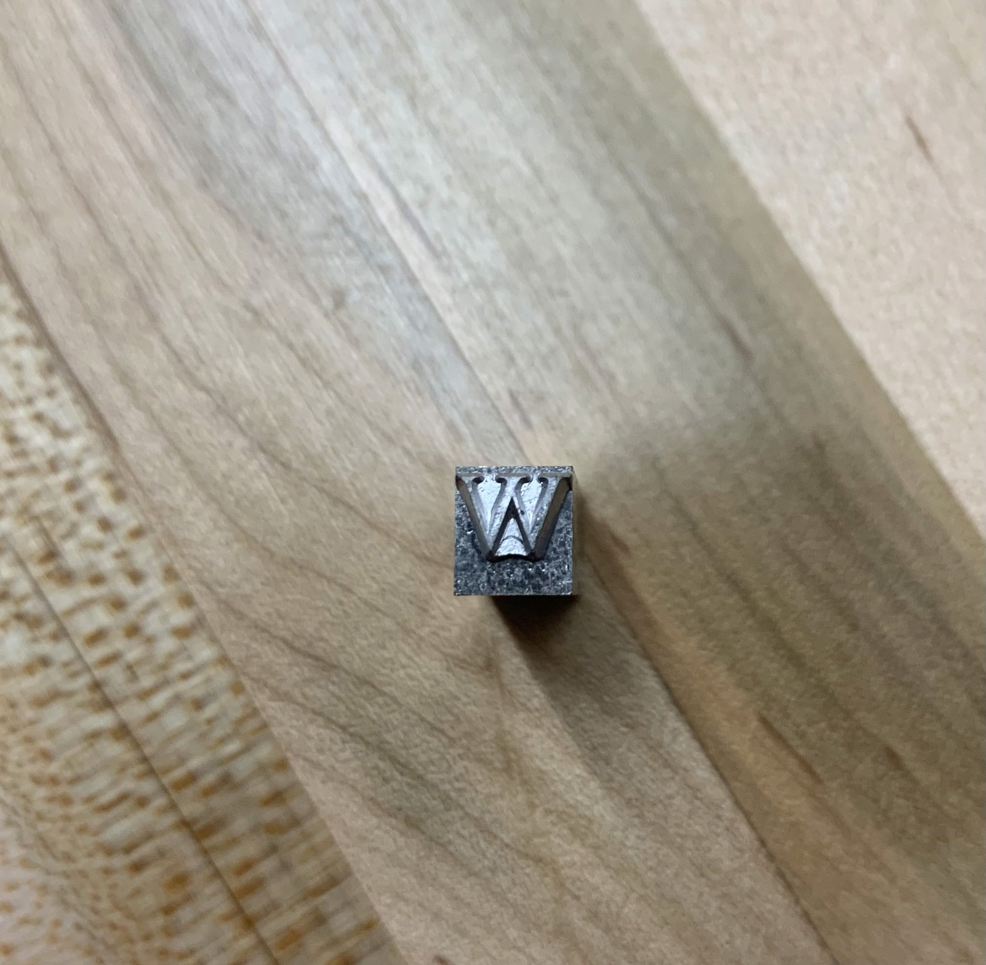


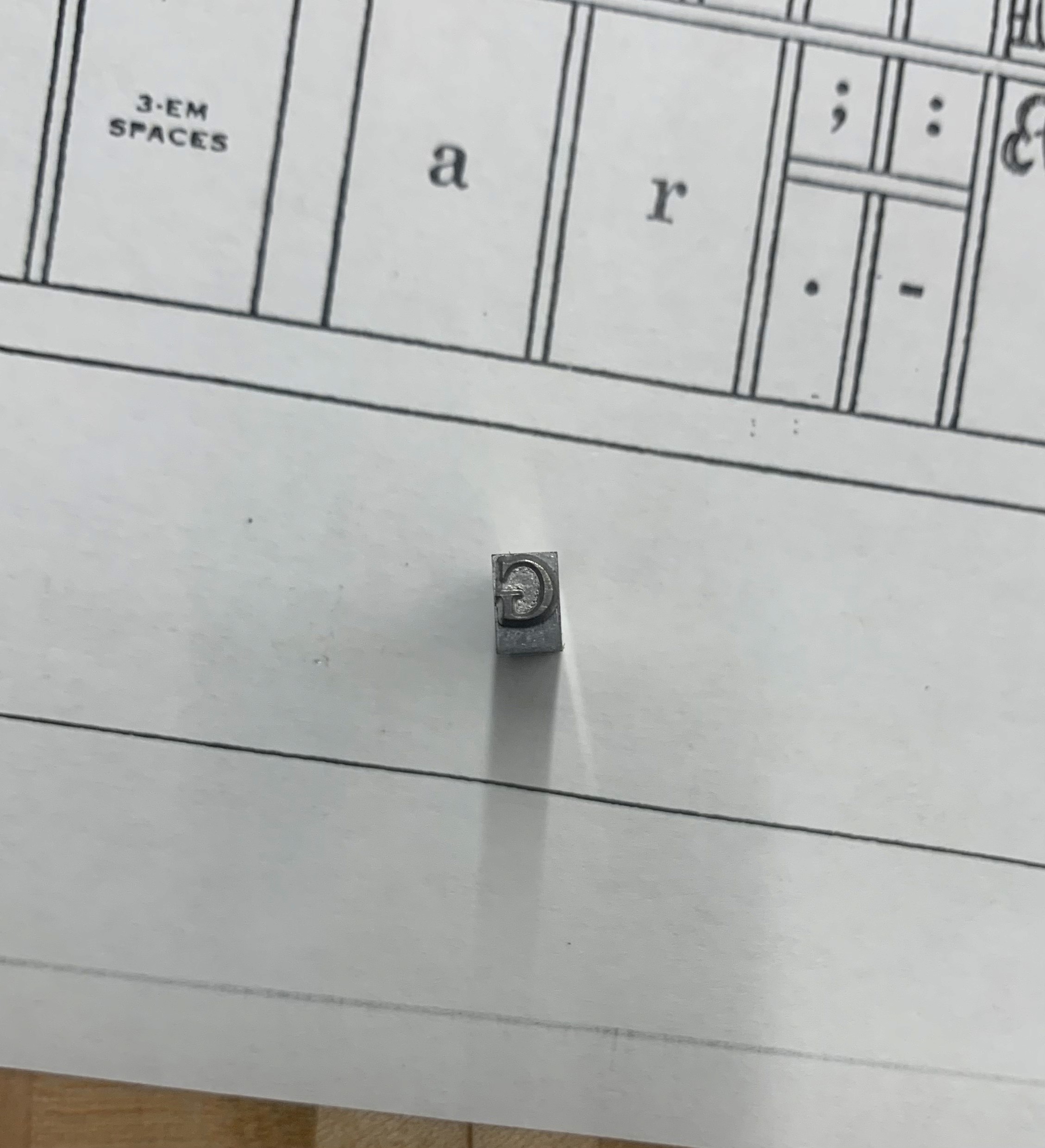


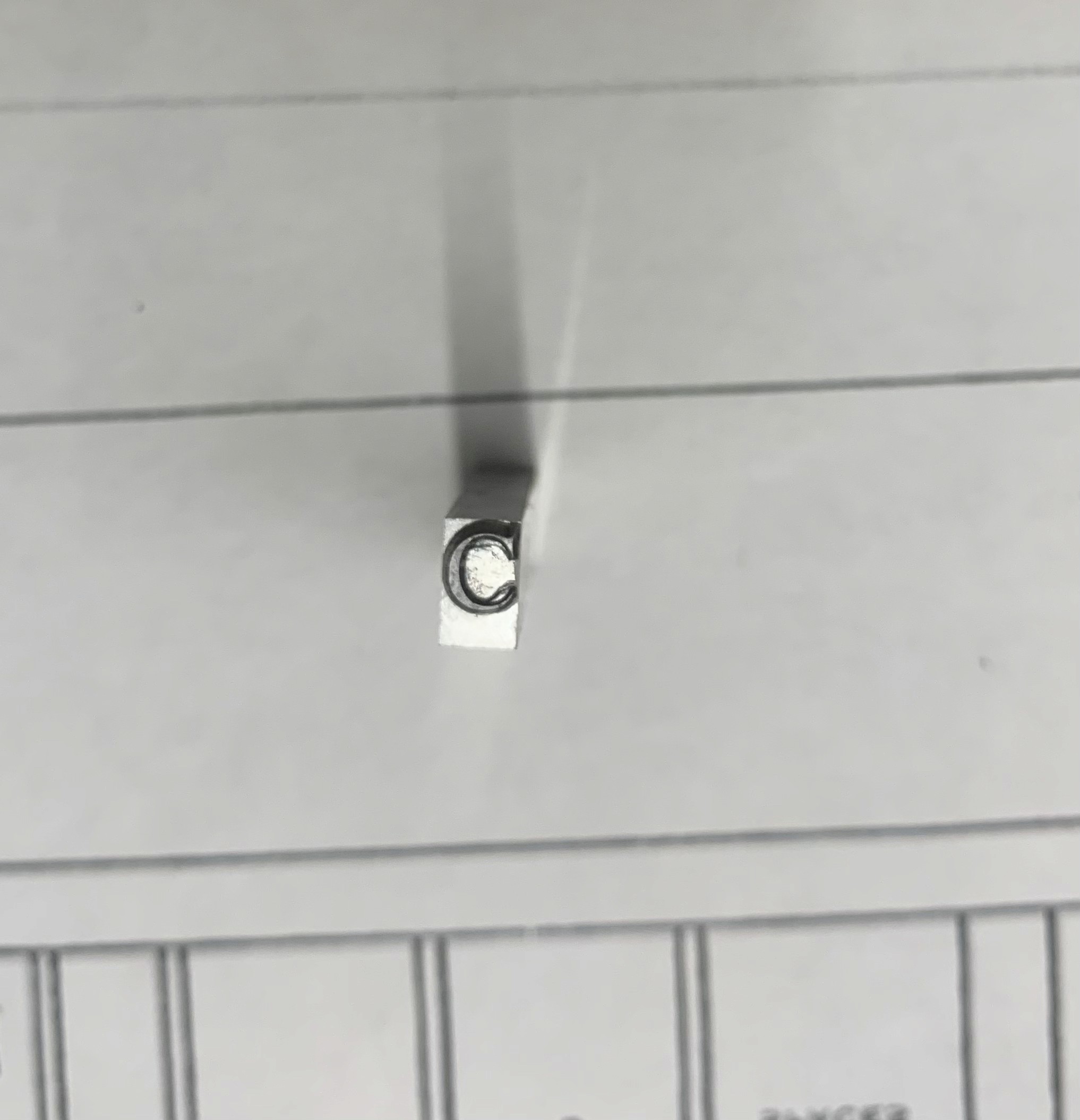
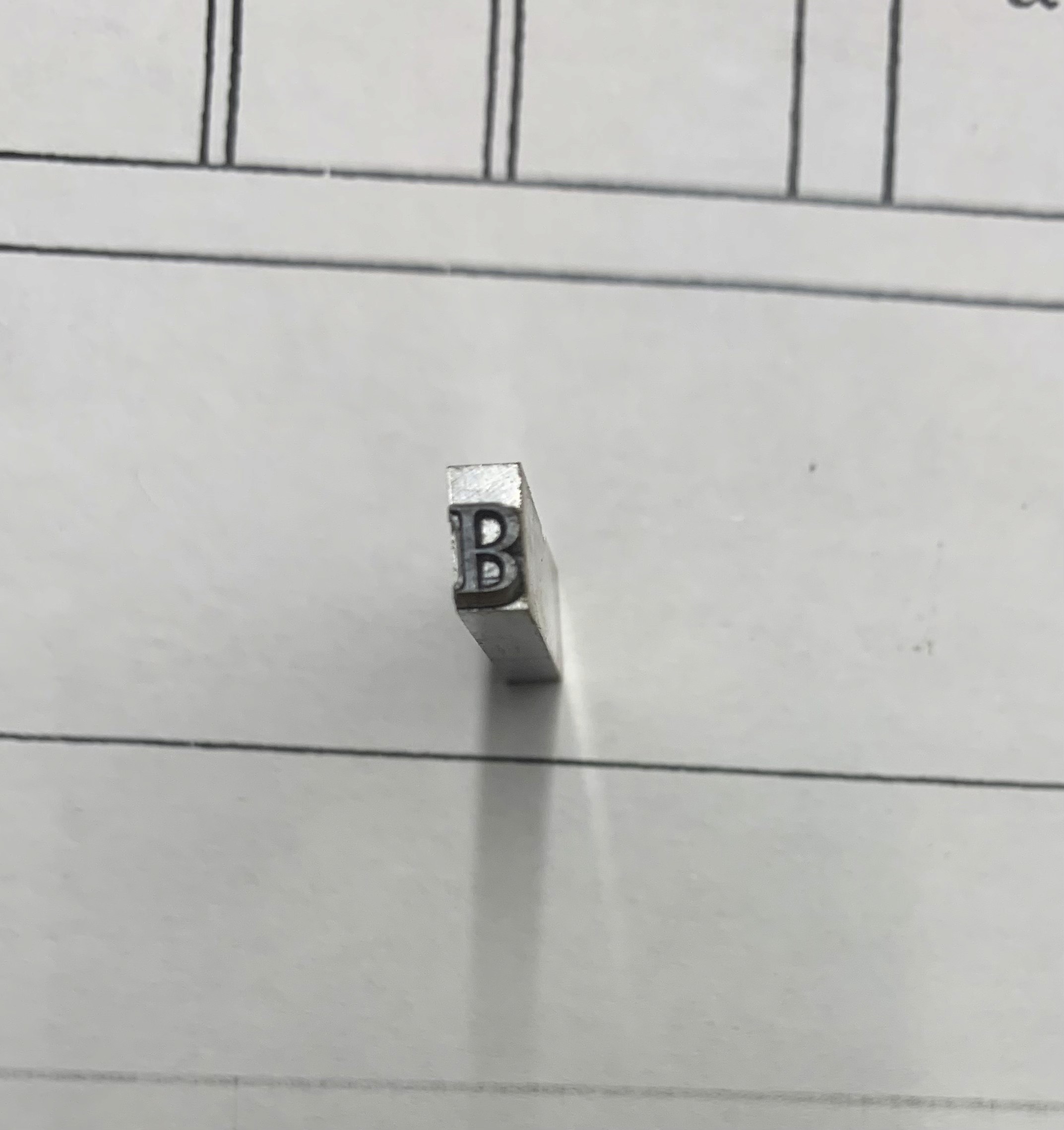

physical references of Perpetua (12pt) found in the TAMU Historical Press Room
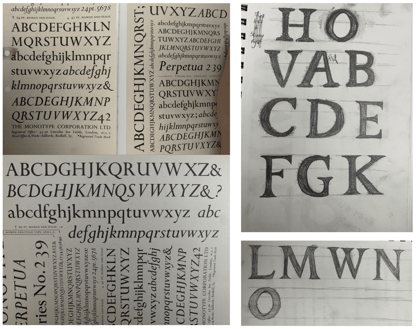
The revival began with a hands-on exploration of the Historic Press Lab's archive, where I selected a hand-carved specimen of Perpetua for documentation. Using my phones camera, I captured photographs of each available letterform from the physical source. I examined the specimen’s structural details—such as the vertical stress, triangular wedge serifs, stroke contrast, and curved terminals—to understand its typographic DNA.
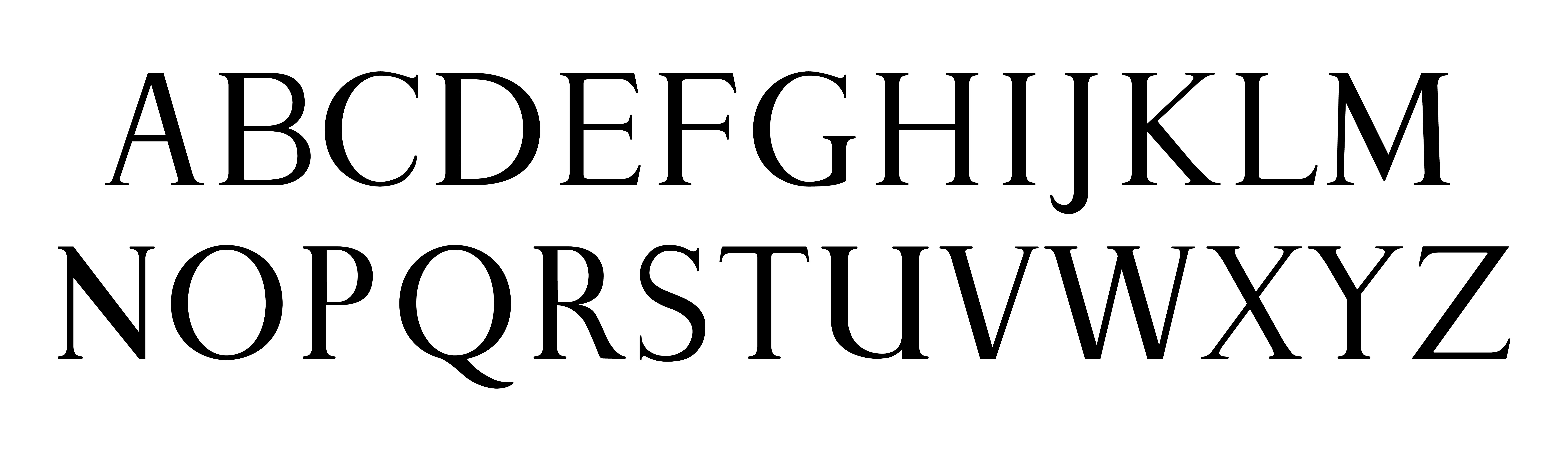
Following documentation, I entered a rigorous hand sketching phase. Across several rounds of drawing, I studied and reconstructed each glyph to identify core stylistic features, subtle inconsistencies, and recurring visual motifs. This analog process helped build a deep understanding of the letterforms' proportions and rhythm—insight that would be crucial for the digital phase.
DIGITAL PHASE
Using Fontra, I then translated my sketches into digital glyphs, beginning with rough vector outlines and progressively refining each shape. I focused on Bézier curve precision, counterform balance, and even spacing to achieve optical harmony. Additional adjustments were made to spacing and kerning, weight consistency, and overall color of the type to ensure the typeface was both authentic and functional in a modern design environment.