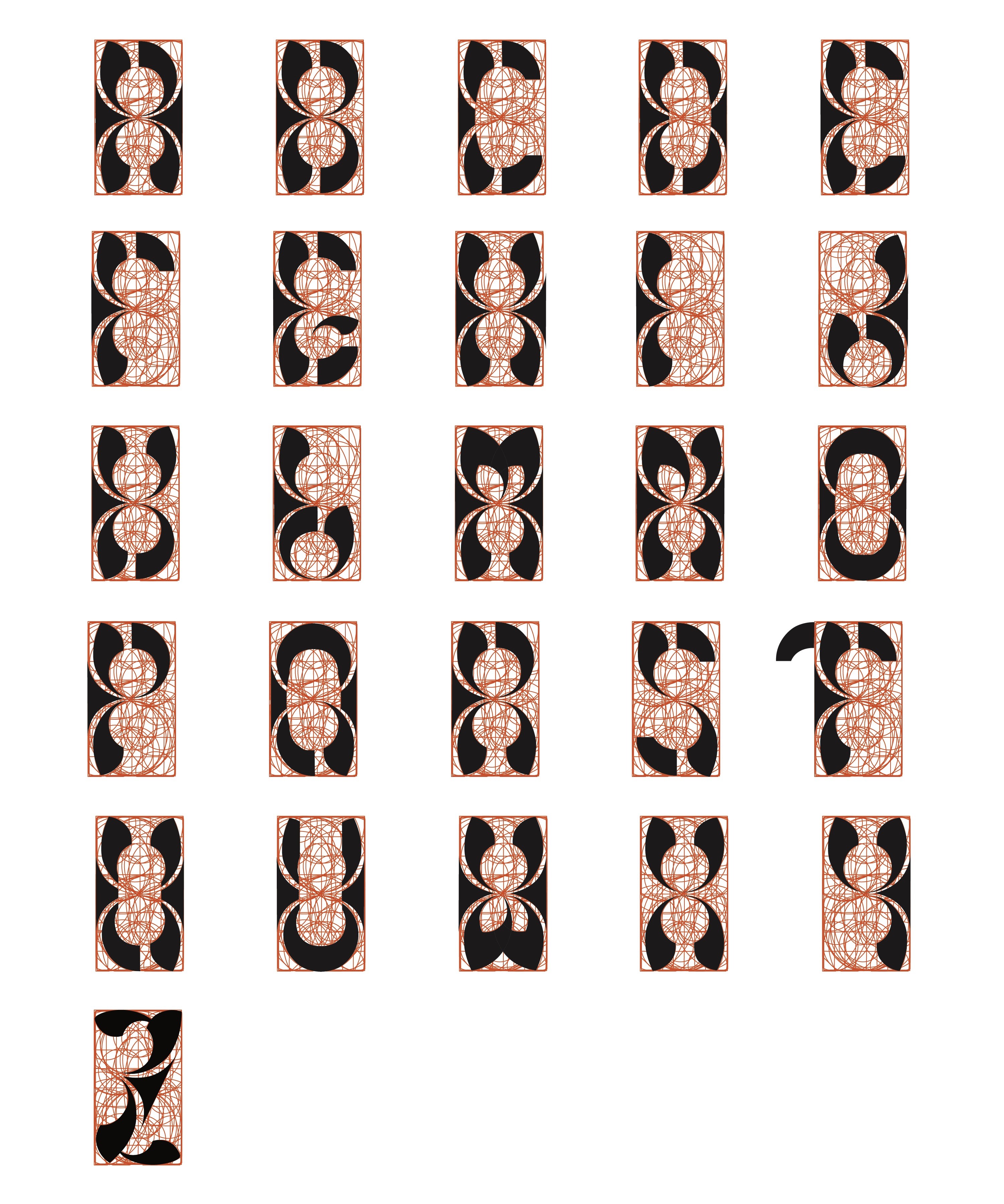
DESIGN PROCESS
Version 1

Version 2
Version 3

Version 4
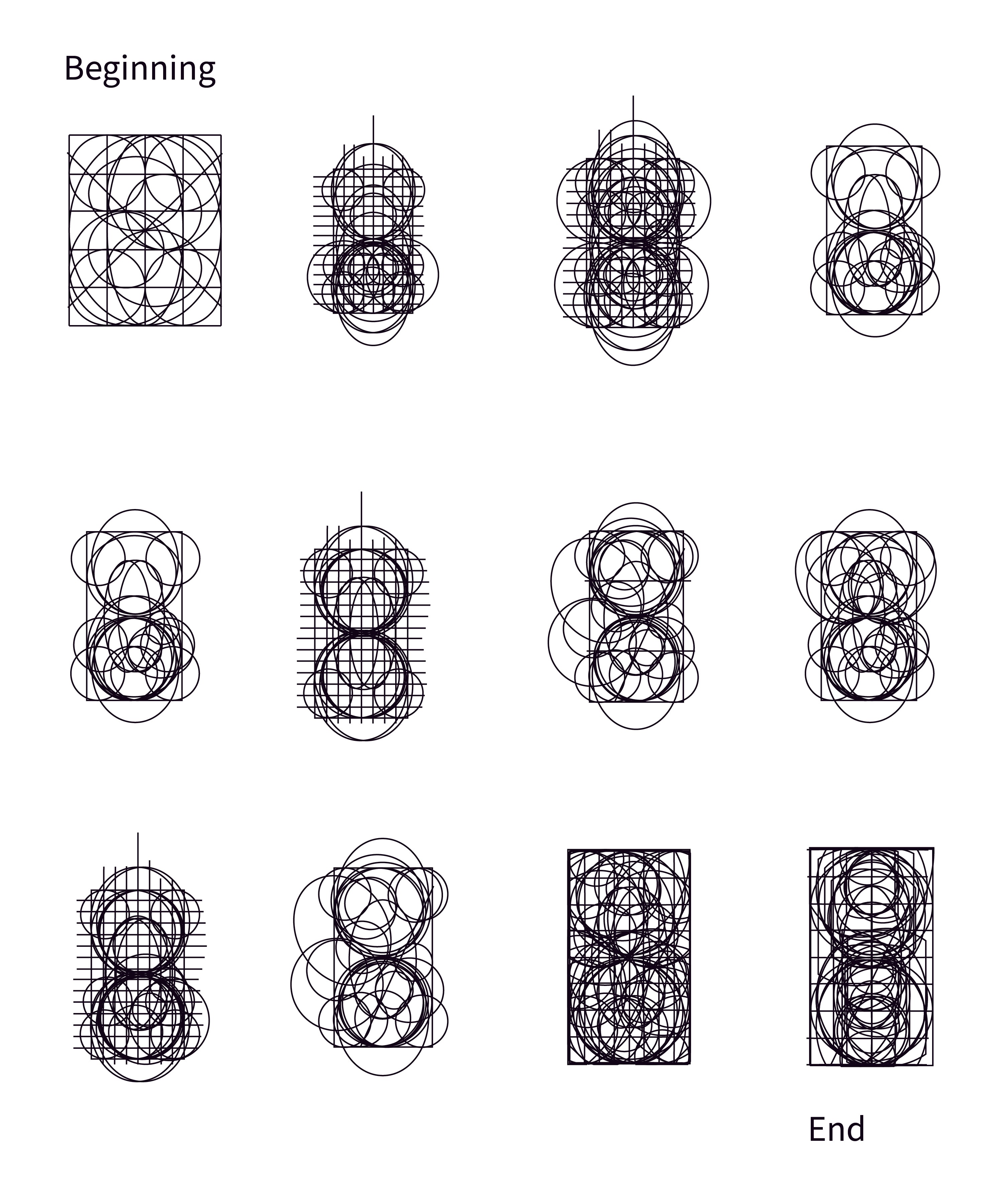
GRID PROCESS
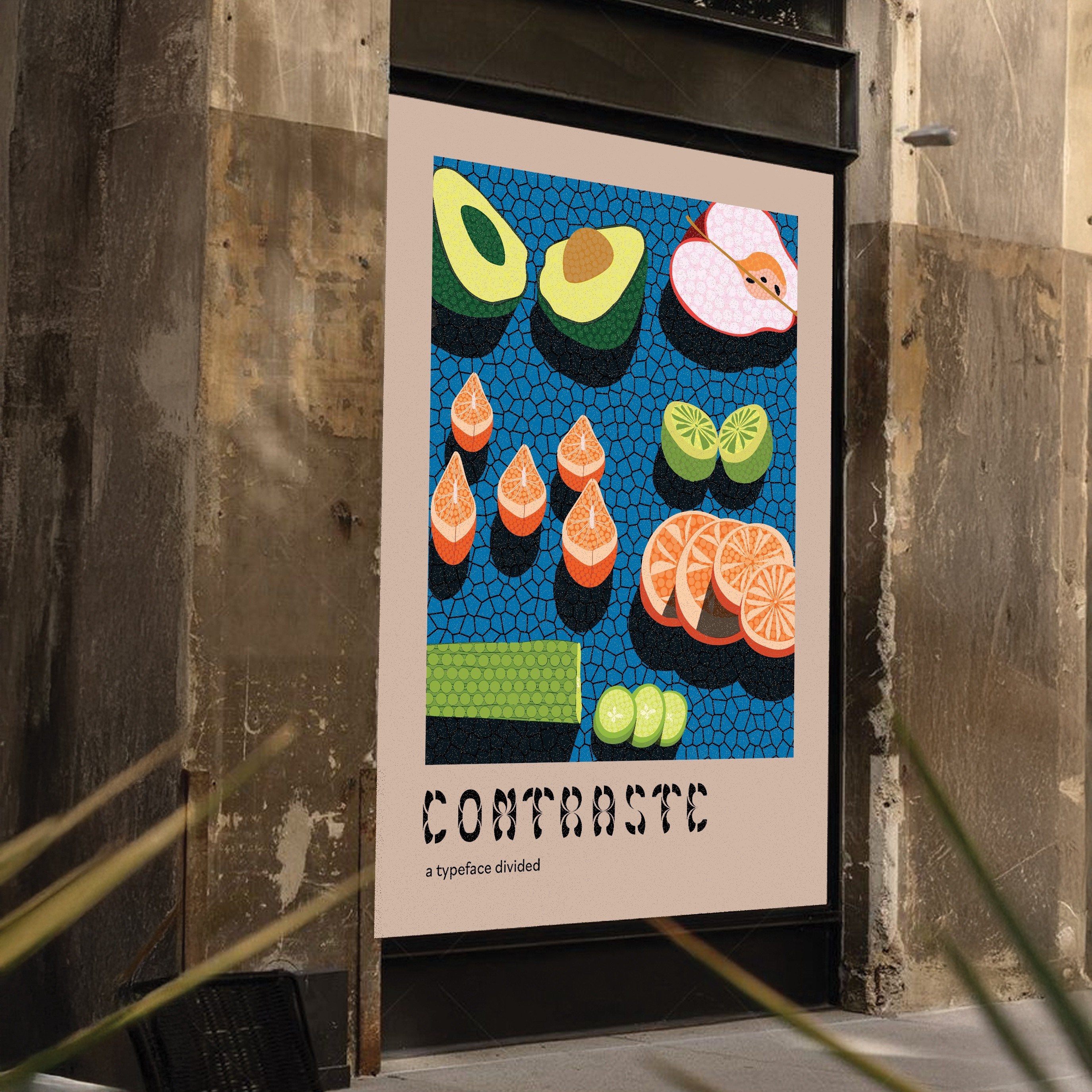
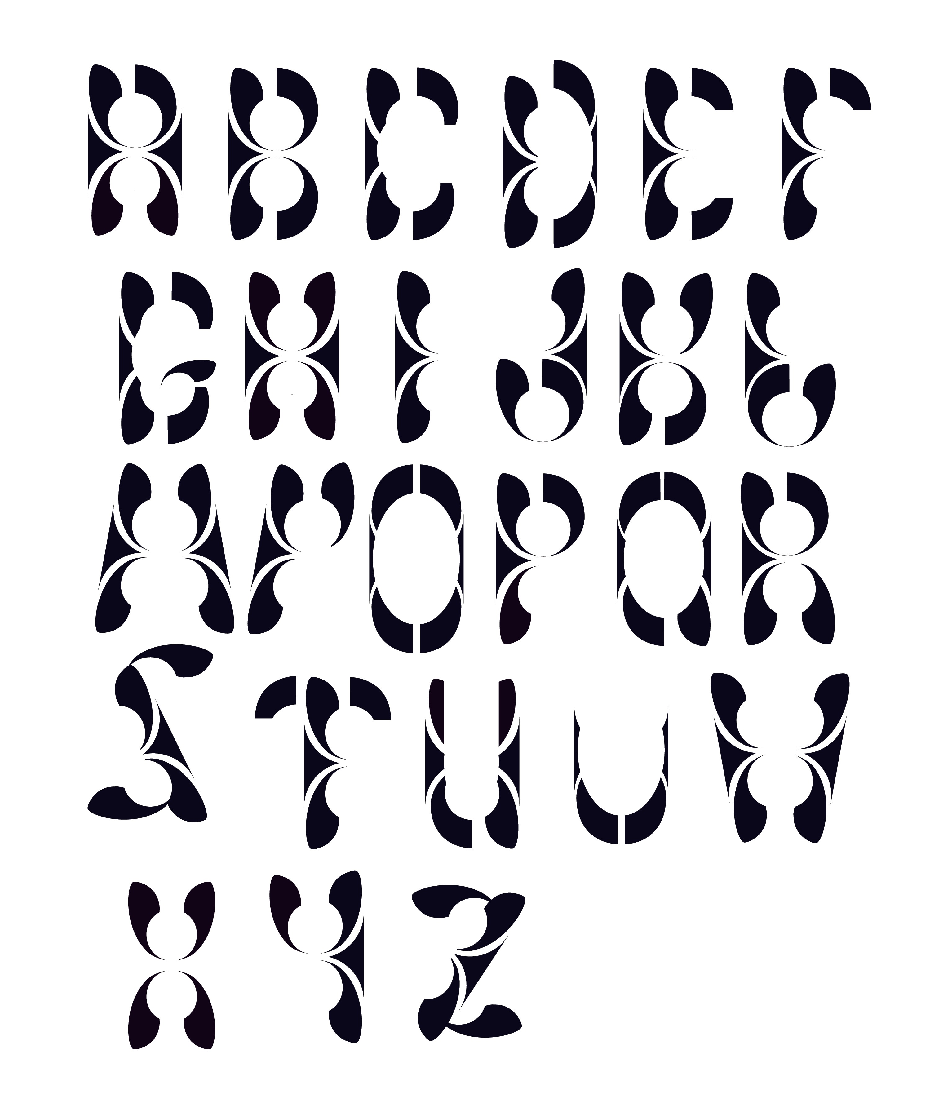
fiNAL outcome
Contraste is set apart by its utilization of negative space. This typeface creates the illusion that each letter is split or divided, adding a captivating and visually intriguing element to the design. This typeface was taken through several iterations in hope to find a successful way to challenge conventional typographic norms. The smooth edges and negative space were meticulously crafted to maintain a sense of elegance and professionalism while still pushing the boundaries of creativity. Although each letter of the type is different they all have a sense of cohesion within the same font family.

